|
Xamarant (noun): A rant about Xamarin.Forms from the developer trenches.
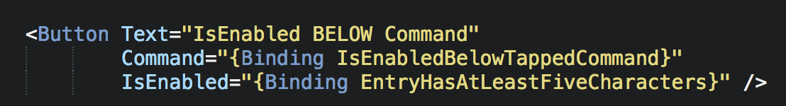
I would have expected the two buttons above to work exactly the same, and was super surprised when I learned (the hard way) that the order in which you declare the IsEnabled and Command property has major significance when writing your Xamarin.Forms app! It turns out that if you declare IsEnabled first (as it is in the image above, to the right), the behavior will not at all be what you expect. You absolutely must declare the Command first, and IsEnabled second! 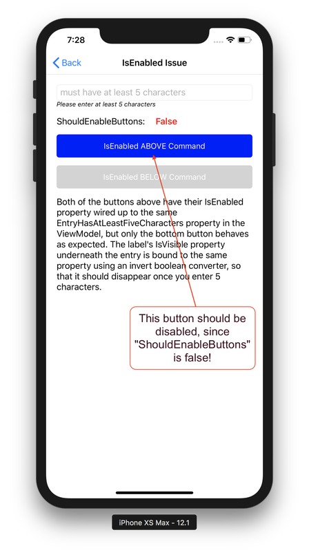 That's freaking nuts.
One might argue that you should not be using IsEnabled at all in an MVVM based app. You should really be using the CanExecute property of the command. This is totally valid, but not everyone will know this, and the IsEnabled is a very simple method of enabling and disabling a button. Both techniques are covered in the Xamarin.Forms documentation, but there are no warnings to indicate that using the IsEnabled property in conjunction with the Command property will radically change the behavior of IsEnabled. There is hope, however, and lots of it! First of all, there is an active issue on GitHub (as of 2019.03.08, anyway) where others have reported the issue, and that might mean there's a chance the Xamarin team will respond. I hope that at the very least, they will add a little warning note on the documentation of the IsEnabled property and Button class. Second, I have a sample project up on GitHub for anyone who needs a hand with this. The master branch demonstrates the issue, but there are several other branches demonstrating how to use the CanExecute functionality of an ICommand to enable/disable a button without using the IsEnabled property at all. Hope this will help some devs spend less time troubleshooting this than my team did.
0 Comments
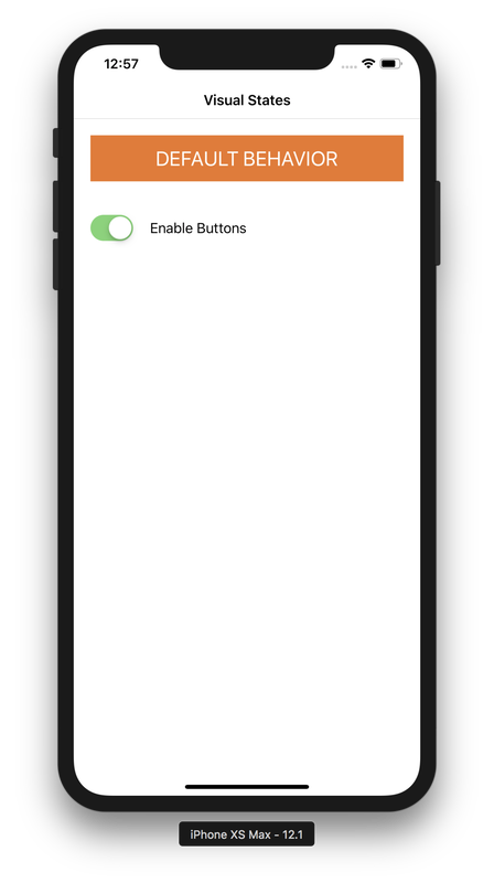
In Xamarin.Forms development, it is pretty simple to disable a control (such as a button) when you want to communicate to your user that the button cannot currently be tapped. Every View element you have on a Xamarin.Forms page has an IsEnabled property. However, controlling the look of a control when you have IsEnabled set to false used to be a serious struggle. Making the button look cool and fancy is no problem while IsEnabled is set to true, but set it to false, and depending on how you've styled your button, it might look just horrible. Mine did! Sure, you could still customize the look. Just write a custom renderer. However, writing a custom renderer is kind of a pain, and requires platform-specific implementations. Xamarin and Xamarin.Forms is here to help us write cross-platform code, and I prefer to keep as much as possible in the cross-platform layer. I'm happy to say that there is some really good news, everyone: Starting with Xamarin.Forms 3.0, the VisualStateManager was introduced, allowing you to have complete control over how a given UI element looks when disabled! This is a super nice addition, and I was unreasonably excited when I learned about it. Let's dig in! Because I want all my buttons throughout my app to have a consistent look and feel, I defined a style in the App.xaml file of my cross-platform project: 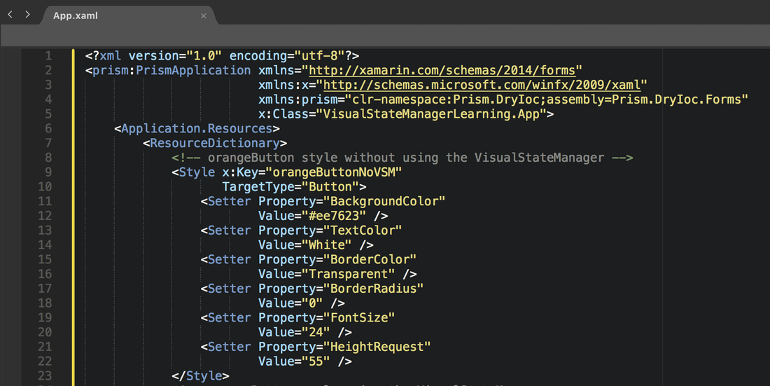 Notice the style has a name ("Key") of "orangeButtonNoVSM". That's a bit of a spoiler for the new style we'll create WITH the VSM (Visual State Manager)! The default behavior for setting the IsEnabled property of the button makes it look like the following (on iOS... This is approximately the same on Android):
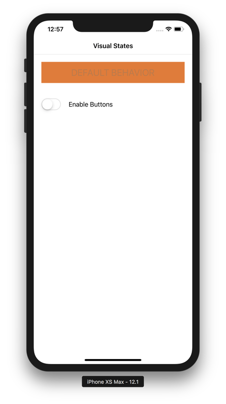
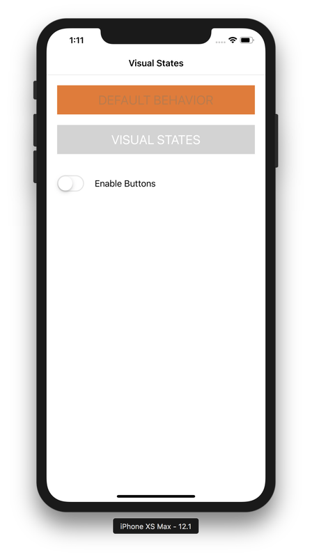
The look when IsEnabled is true is fairly simple... It looks exactly as we want it to, based on the style we created above. The look when IsEnabled is false, however, is not at all how I would like it to look. It used to be a super difficult task to try to control the look when disabled, but with the VisualStateManager (introduced in Xamarin.Forms 3.0), it becomes relatively straightforward. Let's go back to our App.xaml file, and add a second style... This one with some extra code to make use of the VisualStateManager: 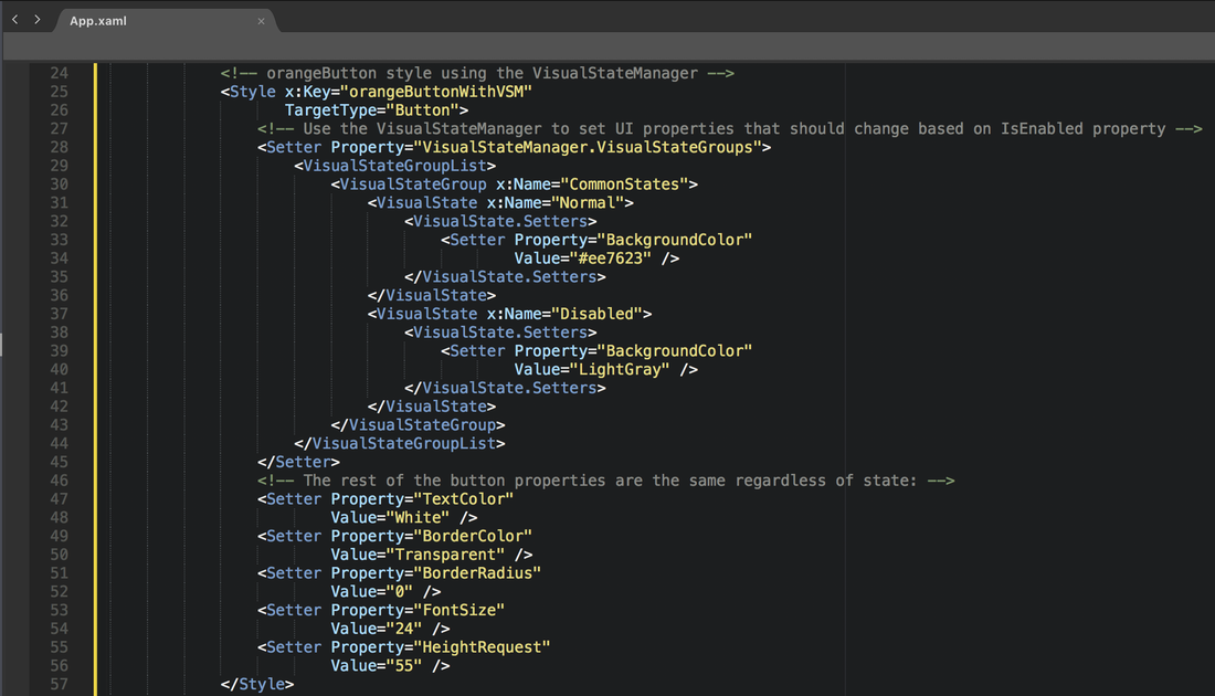 Notice the Setter for VisualStateGroupList. Adding a second button to the UI, I've set one to exhibit the default behavior (as we already saw above), and then a second to show a button using our new style, "orangeButtonWithVSM". Flipping the switch beneath the two buttons sets the IsEnabled flag to either true or false for both buttons:
Infinitely better and much more professional looking! One of these styles would do great in production... One is better for an early beta before you have everything dialed in. Even if you don't love orange as much as I do, I hope this helps you design your apps to be even more beautiful and user friendly than ever before!
If you're interested in seeing this sample code, have a look at my GitHub repository. Feel free to use the comments below to ask any questions! |
AuthorJon Bachelor: This geek goes all the way to 11. Archives
March 2019
Categories
All
|
| jonny b |
|
 RSS Feed
