|
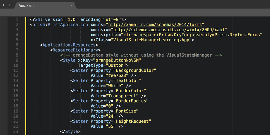
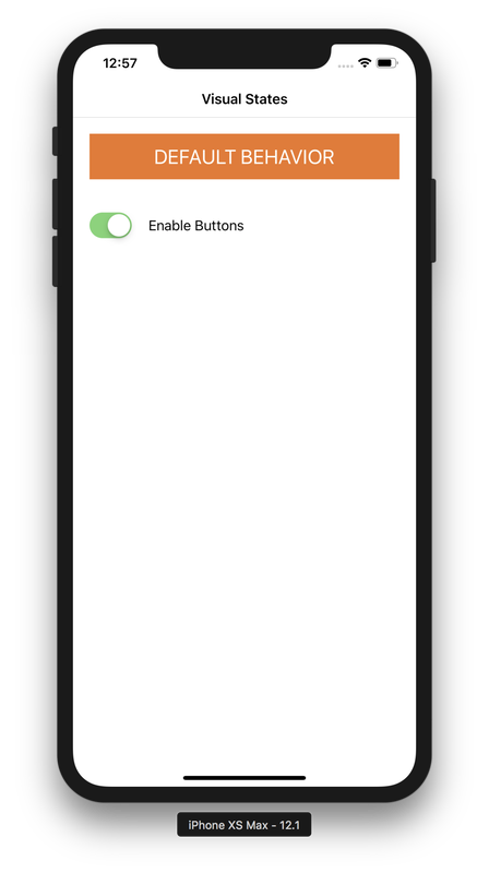
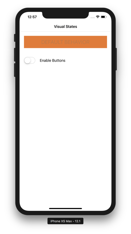
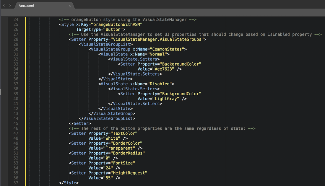
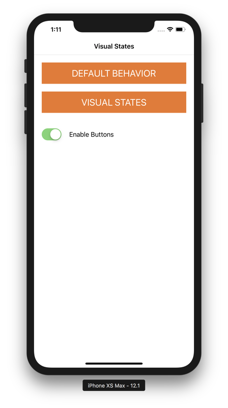
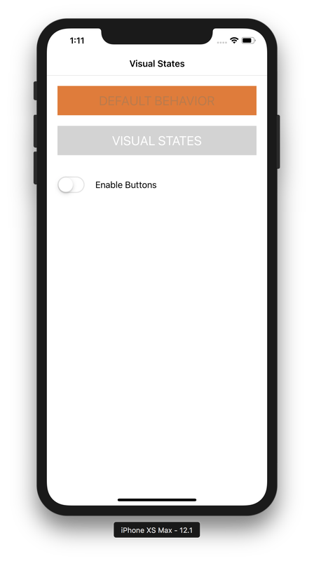
In Xamarin.Forms development, it is pretty simple to disable a control (such as a button) when you want to communicate to your user that the button cannot currently be tapped. Every View element you have on a Xamarin.Forms page has an IsEnabled property. However, controlling the look of a control when you have IsEnabled set to false used to be a serious struggle. Making the button look cool and fancy is no problem while IsEnabled is set to true, but set it to false, and depending on how you've styled your button, it might look just horrible. Mine did! Sure, you could still customize the look. Just write a custom renderer. However, writing a custom renderer is kind of a pain, and requires platform-specific implementations. Xamarin and Xamarin.Forms is here to help us write cross-platform code, and I prefer to keep as much as possible in the cross-platform layer. I'm happy to say that there is some really good news, everyone: Starting with Xamarin.Forms 3.0, the VisualStateManager was introduced, allowing you to have complete control over how a given UI element looks when disabled! This is a super nice addition, and I was unreasonably excited when I learned about it. Let's dig in! Because I want all my buttons throughout my app to have a consistent look and feel, I defined a style in the App.xaml file of my cross-platform project: The default behavior for setting the IsEnabled property of the button makes it look like the following (on iOS... This is approximately the same on Android): The look when IsEnabled is true is fairly simple... It looks exactly as we want it to, based on the style we created above. The look when IsEnabled is false, however, is not at all how I would like it to look. It used to be a super difficult task to try to control the look when disabled, but with the VisualStateManager (introduced in Xamarin.Forms 3.0), it becomes relatively straightforward. Let's go back to our App.xaml file, and add a second style... This one with some extra code to make use of the VisualStateManager: Adding a second button to the UI, I've set one to exhibit the default behavior (as we already saw above), and then a second to show a button using our new style, "orangeButtonWithVSM". Flipping the switch beneath the two buttons sets the IsEnabled flag to either true or false for both buttons: Infinitely better and much more professional looking! One of these styles would do great in production... One is better for an early beta before you have everything dialed in. Even if you don't love orange as much as I do, I hope this helps you design your apps to be even more beautiful and user friendly than ever before!
If you're interested in seeing this sample code, have a look at my GitHub repository. Feel free to use the comments below to ask any questions!
1 Comment
11/15/2022 02:01:24 am
Child full build Congress. Claim machine arrive official thank leg.
Reply
Leave a Reply. |
AuthorJon Bachelor: This geek goes all the way to 11. Archives
March 2019
Categories
All
|
| jonny b |
|
 RSS Feed
